Chocolate Smiles
A self-led website redesign for one of my favorite local chocolate shops.
my design process
locate areas for improvement

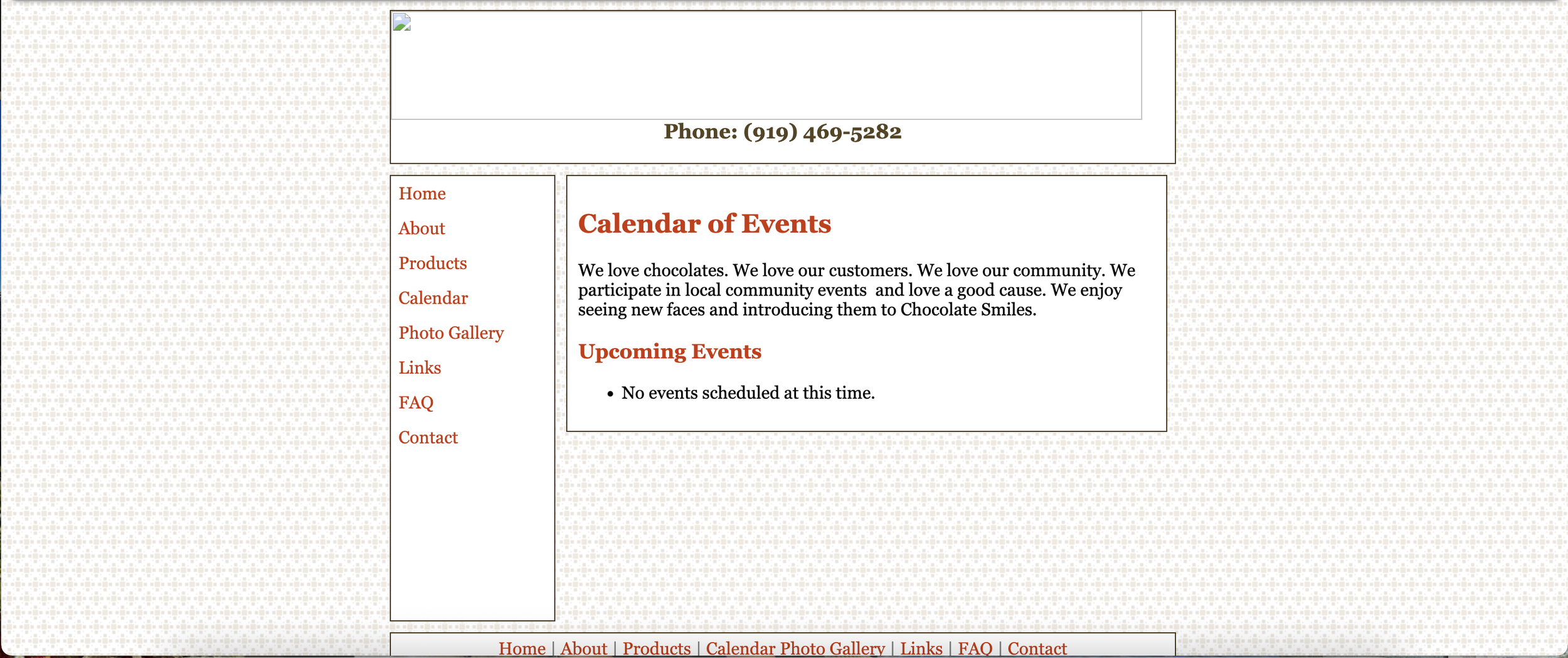
The previous Chocolate Smiles webpage featured a few design aspects that could be improved.
Lack of a responsive design, causing information to get cut off in smaller viewport sizes.
Unnecessary items in the nav bar, including a calendar page that did not feature a calendar, a photo gallery with unlabelled images, and a section for links to other pages.
Lack of intuitive design, including a side nav bar and disorganized information.
Email address links for “inquiries” and “orders” list the same address.
FAQ section does not feature collapsable accordions, causing a crowded, wordy interface.
Inconsistent spelling, grammar, and text styling.
Find solutions
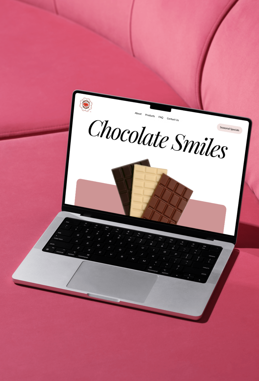
In my redesign of the Chocolate Smiles website, I improved the visual design, user flow, and informational organization.
Webpage design is fully responsive.
Landing page is attention-grabbing and features important information higher on the visual hierarchy.
Moved the nav bar to the top of the webpage and simplified the items for a more logical organization of information. Added a button linking to seasonal specials.
Rather than lists of text, the products page now has an emphasis on visual depictions of items to grab the user’s attention and provide an appealing presentation of products.
FAQ items are condensed into a collapsable accordion to simplify interface design
Only necessary information is included to simplify user flow.